Master E's room is SO close to being done, I can taste it! Just one wall left, but the biggest and best part of the room is in, and I'm psyched! Just as a reminder, this is what it looked like before:
Blah....... minus the little guy in the crib... he's adorable.
And this is that wall now:
It was sunny on Sunday... but look at that wall! Glorious! Here's a close-up of the prints:
It's hard to see with the sun, so here are the originals that were done by my brother [Andy of Arbourne Designs]:
Based on one of my favorite Beatles songs, he took my crappy print idea and made it look about a million times better [that's why he is the graphic designer]. I changed the color on the last print a little because the original that he had done was a little too close to the wall color for my liking.
I think it looks really cute with the mobile that we got from one of D's colleagues at work:
I also put up some pieces on the window-side. The mobile came from E's Oma's trip to Germany last year. The calendar was a gift from my parents, and the canvas was a gift from my work colleagues. I took E's footprints and then colored in some chevron around them to brighten it up a little bit.
In the alcove, I added a shelf [made from charity shop books for £1.50 each, and some brackets the landlord left behind with an old Ikea shelf]. We need a place to put bottles and burp cloths, and of course, Yoda.
Just one last wall to fill, but I know what I want to do. Just need the supplies!
Ahh, Blink. That brings me back to college and my roommate and I listening to the same CD over and over again. This, however, has nothing to do with that, it was just a good title...
Anyway, since the little monkey decided that it was fun to splash in the bath [aka our kitchen sink], it brought us to realize that we have no rug/mat under the sink, so that water goes everywhere. It's my own fault, really. I thought it would be fun/funny if he started splashing and having fun in the bath. Which it is. It's hilarious, actually [especially when daddy gets soaked and I come out unscathed]. But putting a towel on the floor wasn't cutting it [and it looked ridiculous], so I started looking into getting something to absorb some of the chaos.
I couldn't find anything that I really liked anywhere [that wasn't ridiculously expensive], and I had seen this awesome piece on Pinterest that I had pinned ages ago, and I thought, I could make something like that [obviously it won't be as stunning as these, I'm not delusional]... I can braid hair, so why not material? Plus, having a boy makes it less likely that I'll be braiding anyone's hair anytime soon.
It was really easy to do.
Step 1: I just took a few of the t-shirts that I have thrown in a box to use for projects [I did a major clean out a month ago or so... I've also packed away all of my maternity clothes, huzzah!], and cut them across the chest, armpit-to-armpit.
Step 2: I then cut 9 strips of fabric from each of the shirts [I actually added in two more shirts because 5 wasn't quite enough... 7 wasn't enough either, but I'll get to that].
Step 3: Take three of the strips and tie them together. Then I looped the fabric around the hook of a metal hanger and braided the fabric until I got to the end and tied another knot. Letting an infant play with the braided fabric is optional.
Step 4: Pick a pattern and line up the strips, then run some thread across the braids to attach them all together.
That's it! So easy - and washable [since it's just old t-shirts]! It's a little small for a rug, but it's good enough for now. If I ever want to add to it I can just cut the thread and add in some more material. I might cut a little of the anti-slip mat out from under the rug in our living room to keep it from sliding around on the tile, but I'll worry about that later.
At least that one tile under the sink doesn't get wet when we give the monster his bath!
AllAllSo when we moved into this place we knew about the soft blue walls and red/silver damask wallpaper in the living/dining room, but we weren't really sure what we were going to do with it. This one room was almost as big as our whole previous apartment, so we needed a bit of an upgrade on the furniture. There is some beautiful [if only slightly uneven] hardwood flooring, which Dan hates, but I LOVE. We have an unused/blocked off fireplace, so we have a nice little mantle to display all of our little knick-knacks [and hang our stockings from when the time comes in a few short weeks!]. But somehow everything in our living/dining area is blue, red and white, so we've got a bit of a nautical color scheme going on, and if we can keep it clean, it looks pretty nice [though that is really hard to do with a baby...].
We asked our landlords if they wouldn't minds leaving their dining set
for us, because for the past three years we were using my old desk as a
dining table. Now we can use the desk as an actual desk, huzzah!
Actually it's used as a table where we keep our phone, printer and
take-out menu's [just in case I'm feeling lazy... or if the boy is going
crazy...], plus the stroller blocks it now...
Somehow we actually managed to not spend too much money in this room
considering that we had to buy all new sofas and chairs. I was actually
originally going to use our old sofa, but re-cover it, and just add on
another sofa or a couple of chairs, but we got such a good deal on this
set that we could donate our old sofa, and never have to look at it ever
again! We got our sofa set [including a 3-seater sofa, armchair,
accent chair and storage footstool] from DFS
for £830 total. It was a floor set that they were trying to get rid of
to make room for the new lines coming in, and it was by far the best
looking set in the whole place [by miles]. The accent chair doesn't
match the room at all, but I am going to buy some fabric to make a slip
cover at some point.
The console table behind the sofa is something that I made, based one something that I saw on Young House Love. I bought two white desk legs [they look like mini-bookshelves] from Ikea
for £30 each, and then nailed 4 1"x4"boards to the top to span the two
legs [I found these in our shed when we moved in, so we didn't pay for
them at all]. I painted the wood white with our leftover trim paint and
BAM! Console table for £60!
We got the curtains and pole from Linens Direct for £50 total. Not bad for sheers, curtains and one pole. The rug is from Next
[£53.99 inc. shipping] and I've already managed to ruin it [I put it in
the washing machine after E peed all over it... turns out the colors
ran everywhere]. It doesn't look bad, just a little tie-dyed in the
white parts. We also just bought a couple of anti-slip mats for
underneath so it wouldn't slide all over the place [£19.98 for two at Argos]. We had to get a new TV stand, because our old one was too wide [and I turned that into some artworks in the guest bedroom], which we also got at Ikea for only £25. The only other thing that we bought for this room was a small Billy bookcase from Ikea for £27 [in which to keep all of our boring stuff, i.e. bills and other assorted paperwork].
Everything else in the room came out of our old apartment, either the
living room, or the bedroom. I still have a couple things to do in
here, like the slipcover for the chair, and finishing up one of the side
tables [but that's almost done - and it only took me 4 years!]. D also
wants me to 'make his bookcase funky' like I did for mine a few years
ago, but that will be another free and easy project, that I can get to
during nap time.
Not many this week either! We're very quickly running out of backgrounds for my little man, and I now realize that we should have started with smaller objects to lie on at the beginning, but he was so long from the start! Oh well... it was a pretty plain one this week:
Funny daddy!
Why are you doing this to me?
Oh, mommy's here, too!
Talking to mommy...
Now it's time to get daddy really involved... but this led to the money-shot:
I figured it would be nice to document that his hands are constantly in his mouth because of the teeth.
Also, it's voting day! So, go out and vote - if we can do it from overseas, you can do it, too!
Pantone recently announced it's color of the year as Tangerine Tango. What a great color! I've been waiting for anything orangey to come out as color of the year. So in the spirit of Halloween and this awesome announcement, I'm going to take some inspiration from this little arrangement:
tginteriors.blogspot.co.uk
How gorgeous is that chair? I love the muted colors with the bright pop of tangerine. I really want that console too... See below for where to buy:
In the UK:
1. Framed Hearts, £17.99 at Debenhams; 2. Orange Foxes Print, £70 at Heals; 3. Sullivan Chair, £399 at John Lewis; 4. Conran Medium Apothecary Bottle, £19.50 at M&S; 5. Lutwidge Multidrawer Chest, £350 at John Lewis; 6. Rabbit Print Melamine Plate, £5.50 at Graham&Green.
In the US:
1. Poppy Wall Art - Orange, $39.99 at Bed, Bath and Beyond; 2. Mexicali Dinnerware - Salad Plate, $6.00 at Pier1; 3. Slipper Chair - Tangerine, $149.99 at Target; 4. Luster Vase - Lime, $9.95 at Pier1; 5. Buddha Framed Art, $29.99 at Target; 6. Minhou Cabinet, $399.95 at Pier1.
Here are the outtakes from our week 19 shoot. There aren't many because the little E-man wanted to roll and play with the dress we used as a background... que sera sera...
Arms went off the grid... it's hard to control a 19 week old... who knew?
Looking at daddy...
We got a little bit of a smile in this last one, so it's the one we went with for our "Halloween" week shot.
I hope everyone on the east coast of the States isn't treading water in their basements, and staying safe, most importantly. Watch out for that tsunami in the Pacific, too!
Oh, how I love Disney movies... Lumiere, so suave...
Anyway, after that little bit of nostalgia, I fear it is time to move on to the guest bedroom budget breakdown. This is one of the least expensive rooms that we did, so it actually won't be that bad... huzzah!
This is the last room that we did in the whole place because we actually had to sleep in there for the first couple of months that we lived in this house [it seems like a long time ago!]. The owners of the house wanted to get the carpets cleaned before we moved in, but their carpet cleaners never showed up, so we had to organize it ourselves once we moved in. So as soon as we got all of our stuff moved into the house, the only thing that we put together was our bed, and we stayed in there until all of the carpets were cleaned [and we bought our shiny new bed].
This room was originally one of the owners little girls' rooms, so it had robin's egg blue walls, and a flowery blue/beige wallpaper on one of the walls. It's a really awkwardly shaped room, so we couldn't layout the room as I had originally thought we could [it was hard to tell when there was only a single bed in there before].
By the time we finally got around to painting this room, I was 37 weeks pregnant, so D had to do almost all of it [I was getting really dizzy doing the master bedroom, so I had to take it easy when it came to this one]. I think it's safe to say he now hates painting. Anyway, we bought the paint from Wickes [as per usual] and the color was Calico, which is basically beige. I wanted something darker, like a mocha color, but it was just too dark for this room with the sloping ceiling and only one small window. So we spent about £30 on paint for this room. We really should have done the trim and cupboard doors in the white, , but D was fed up, so I let it slide...
All of the furniture in this room comes out of the old apartment, so we didn't have to but any of that once we moved in here. The bed linens are from out old place too, so we didn't have to spend any extra on that either. Funny side story: the wardrobe has no door on it because we never picked up the doors when we originally bought all of our furniture [EVERYTHING in our old apartment was from Ikea and we got it all in one day... actually we almost got divorced on that day... so stressful!]. Luckily we had two curtains that we had picked up for the bedroom and only needed one, so I bought a tension rod from the pound shop and used the other curtain panel as a cover for the wardrobe. That wardrobe is only used for my work dresses and D's suits now, so we never bothered to buy the doors for the wardrobe.
The roller blind in this room was left behind by our landlords, and it
works perfectly. The pendant light is from John Lewis and we had that
in the living room of our old place. The artwork is my own, and really easy to do. I just took some of our left over painters tape, and wrote out the words I wanted [In this case it's from All You Need is Love, by The Beatles... and if you didn't know that, shame on you!] on the top to our old pine TV unit. I then painted over the tape in Wickes Raspberry [£1.50 for the tester pot]. I was going to pull the tape off to show the wood behind, but D really liked the look with the blue painters tape, so I left it, and I'm glad that I did!
The mirror is new and that came from Ikea [£14.99], and the decorations
on the dresser are knick-knacks that we already had from trips/various
places that we've lived. The candle on the left was a gift from my
sister-in-law from Lithuania, the tea-light holders are from Ikea, and
the Dala horse is from one of my many trips to Sweden [I'm a little
obsessed]. That clock is one of the many clocks that D has spread
around the house... seriously, we have about 15 clocks in this place...
It looks a little sparse, but I do have a few things to add so it
doesn't look like the mirror is a mile above the dresser...
The framed prints on the short wall were all ripped out of a book that I have [Tricia Guild, Inspiration]. It has a lot of really colorful images inside meant to inspire interior design [I really think it's just a promo to use Designers Guild fabrics/wallpapers], so I cut them out and put them in our left-over Ikea Ribba frames, and scattered them across the wall.
I made a couple more Beatles inspired artworks for the wall behind the bed, I just haven't put them up yet... This was a really easy project. I just took the sides from the TV unit [the same one that I made the pink love artwork from before], printed out some bird silhouettes that I found online, cut them out and stuck them to the boards. I then painted around them using a tester pot of Wickes Sweetcorn [£1.25] , then pulled off the bird to leave a wooden silhouette. I then glued on a couple of branches that I cut from the back yard and wrote the lyrics to one of my favorite Beatles songs [Blackbird] in black permanent marker. With drying time this whole project only took a couple of hours, and they look really cool [I think!]. Now to get them up on the wall...
So that's it! I'd like to buy a little rug/runner for this room, but it's totally not necessary, so I'll wait until I find something that I really like. It's just the guest room anyway, and the only people that have ever used it are my parents... and I don't foresee anyone else using it [unless someone wants to come visit!]. Total cost for this room: £17.99. Bargain!
I thought it might be fun to post the outtakes on the Monday after I take E's weekly photo, because, let's face it, the kid is freaking adorable. So here it goes:
"What are you doing to me?"
"Mommy's funny!"
"Alright, Mommy, we get it... please stop taking my picture."
"Ugh, this is exhausting!"
This is our new thing... rubbing the feet together. It's usually used to get shoes/socks off.
Night fever! This is the one! [And I didn't even need Daddy's help to get the smile... boo-yeah! Does anyone say that anymore?]
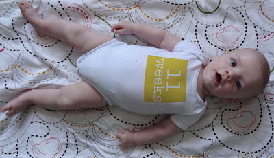
I think we may have to go up a size in these onesies soon...
Probably the most common question that I was asked while I was in Maine was, "Where do you get those onesies that you use in your weekly pictures of the baby?".
Quick answer: I don't.
Long answer: I use Photoshop to put the weeks on his onesies, and here's how...
As a little bit of a disclaimer - I totally stole this idea from Young House Love [quite possibly the greatest blog ever... check it out!], and they're a lot better at it than I am, but it was a great idea to log how much your baby grows over the weeks. Plus, it makes you take at least one picture a week once the novelty wears off, and you're more focused on dealing with teething and back to sleepless nights... but I digress...
I start by taking a few pictures of the big guy on a patterned background [this one is from week 3]:
[look at those little chicken legs!]
I open the photo in Photoshop, then I cut the size in half by going to 'Image > Image Size':
I then cropped the photo so you wouldn't see the floor below [this was back when he still fit almost completely on the footstool]:
I then create a new file to the size 300x300 pixels, fill the background [I usually use the eyedropper tool to pick a color from the background of the photo so it will match, but I didn't in this case... not a great example...], and then type the number of weeks in white on top [I use American Typewriter for the font - and you can keep using the same file every week to keep the size/layout consistent throughout the year[s]]:
I then merge all the layers in that file [on a mac it's Apple > Shift > E... I have no idea on a PC], and simply drag the weekly label onto the onesie:
One there, I rotate the number by going to Edit > Transform > Rotate:
And then to make it look more like the shape of the body in the shirt, I warp the number to match the lines of the onesie around the boys body by going to Edit > Transform > Warp:
I then go to the layer toolbar and where the drop-down says 'Normal', and then go to 'Multiply':
That's it! Easy-peasey, right?
Anyway, here are all of the weeks so far... gotta love that growing boy!